
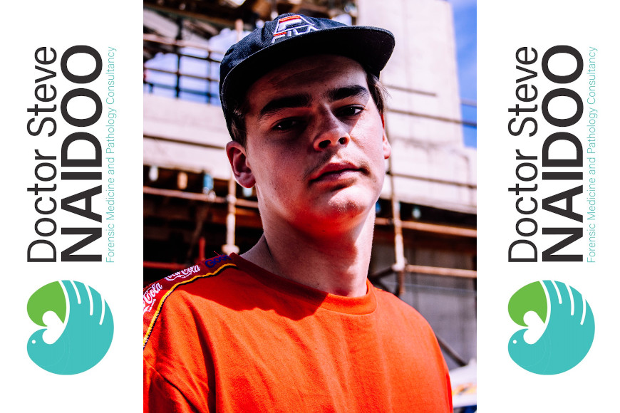
Giving students the chance to become more ‘engaged students in terms of entrepreneurial opportunities is DUT’s Mthandeni Zama, who is from the Visual Communication Design – Graphic Design department. His second-year students were given the chance to participate on a project in June 2020 for one of the most prominent forensic pathologists in South Africa, Dr Steve R Naidoo. They were asked to create a brand (Logo, visual language and branding material) – for the distinguished pathologist.
Five selected students successfully unpacked their branding ideas to Dr Naidoo, their first real client.
 He relayed that the five students (Tshiamo Molehabangwe, Sinenhlanhla Maphumulo, Ovuyonke Sotsaka, Brett Caldecott and Courtney Shelley), were thrilled to be able to showcase their logos and be in the running of being chosen as the winner of the brand designing logo competition.
However, after much deliberation, Dr Naidoo had to make a decision and chose the winning logo out of the five students, who is Brett Caldecott.
Dr Naidoo thanked Zama Mthandeni from the Visual Communication Design – Graphic Design department for the unique and unrivalled opportunity to be the subject of a project by his class of students.
He said that he found all the branding symbolism and their applications by all the students to be of a very high standard although he is just a lay observer and not with any creative eye, let alone any expertise or skill in this area.
“My hope when asked to share with your group my specialised work was to have a logo and brand that would be simple, appealing, recognisable and enduring. The submissions by the selected students have been so impressive and it has been no easy task. Each and every one of the logos and their applications are remarkable and in different ways,” said Dr Naidoo.
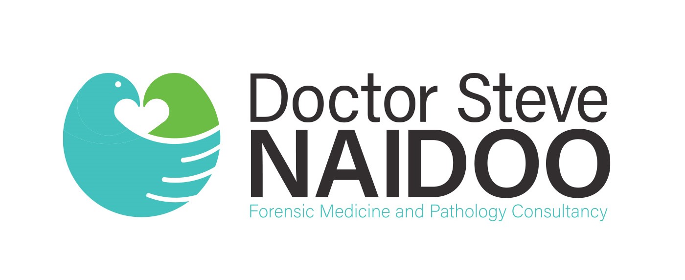
The winner of the logo submission competition was Brett Caldecott’s submission, which Dr Naidoo indicated was a clear winner amongst the other four logos submitted, on the basis of its demonstrative symbolism of caring.
He said that in terms of Caldecott’s logo, the bird of peace is most appealing for his type of work, and what he sees in its wingspan of feathers is the figure of a handshake by one open-eyed dove or pigeon embracing the other whose eyes are closed, with a heart shape at its central nub.
“A most excellent logo by Caldecott which expresses a human rights theme, serving to help those that have been violated and unaware of their rights, or tending and ministering to hurt and abused persons,” he said.
Dr Naidoo further added that the symbolic clasped hands gesture especially, but also the desktop/screen image on the flyers are very appealing and appropriate for its messages.
Caldecott was very excited to be declared the winner.
“When I first heard the news that Dr Naidoo had chosen my logo out of the rest, I didn’t quite know how to react, but soon after that when it actually hit me that I had won, the smiles and happiness began to show. I felt like I was smiling from ear to ear and it was nice to know that all my hard work paid off in the end,” he said elatedly.
Dr Naidoo also excitedly said that all the logo ideas and remarks he had made for each of the submissions, could potentially be used for his upcoming book publications.
Pictured: Brett Caldecott with his winning logo.
Waheeda Peters